Bodacious Redesign
Bodacious wine is very beginner-friendly and easy to drink. At the same time, the term
"Bodacious" feels luxurious and elevated. The current branding does not work for this brand
as a whole, as it conveys both messages. The purpose of this redesign was to find that
middle ground and maximize both personalities of this brand. The bottles should stand out on
the shelf and look premium, without the premium price point.
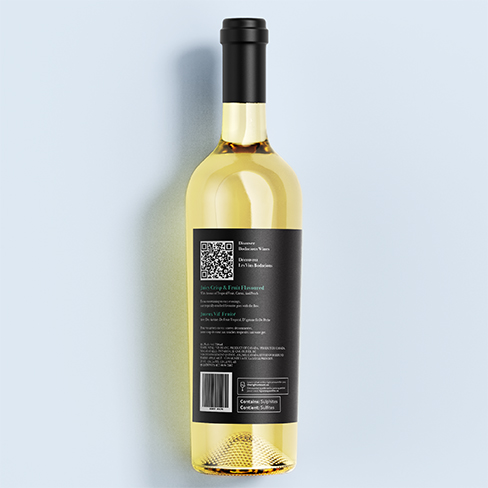
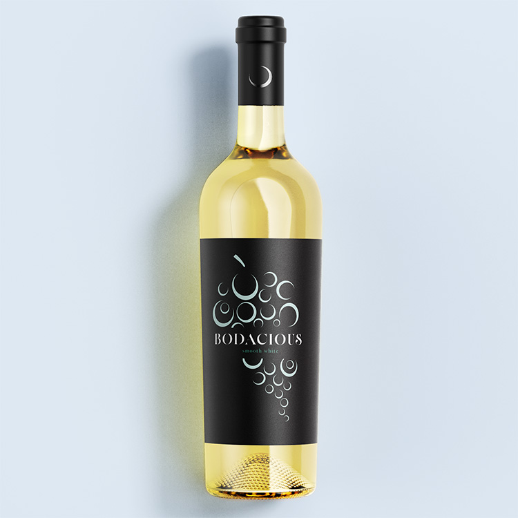
Using black for the label instantly makes this feel elegant. Instead of keeping the original
logo, a new modern sans-serif font is used to elevate the illustration. The abstract grape
forms work well with this to create unity and make this label more eye-catching. To
implement this label into other wines, the single colour can be changed to create a system.
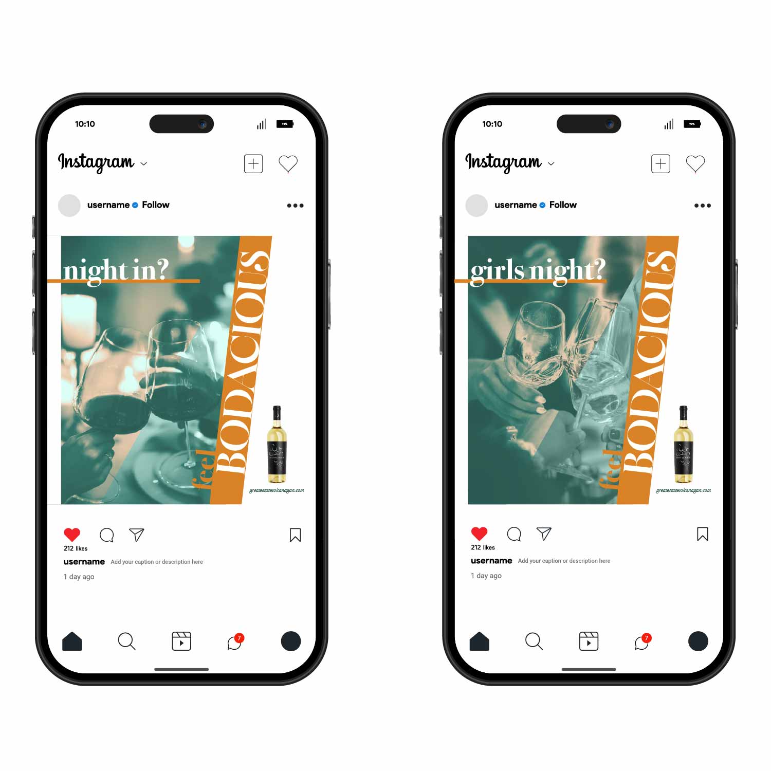
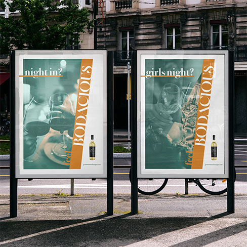
Furthering this new identity into advertising, a similar idea was used to bring
personalities and memories into the concept. Girls night? Bodacious. Duh. It showcases the
versatility of this wine across different spaces and takes a more modern approach with its
imagery and colours.